Warm
We greet by name, remember the coffee order and leave the gate open.
Brand Identity Guidelines
A slow countryside escape in the hills of Romania. This manual holds everything needed to represent the retreat consistently — in print, on screen and on the gate at the end of the lane.
01 — Overview
Who Crocna Retreat is, what it promises and how it sounds when it speaks.
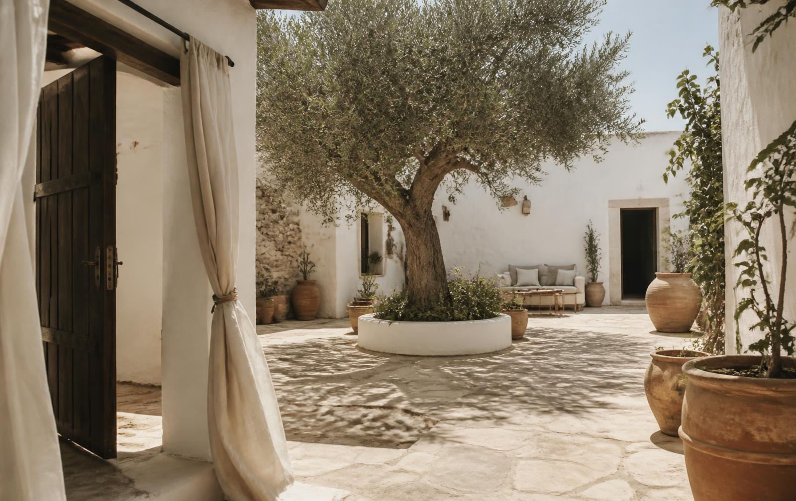
Crocna Retreat was created as a place where people can slow down, reconnect with nature and enjoy the quiet rhythm of the Romanian countryside. Inspired by Mediterranean simplicity and the warmth of village life, every stay is designed to encourage rest, meaningful moments and genuine hospitality. Rather than offering just accommodation, Crocna Retreat offers space to breathe, unwind and rediscover the beauty of simple living.
We greet by name, remember the coffee order and leave the gate open.
Nothing in the experience rushes the guest — not the check-in, not the copy.
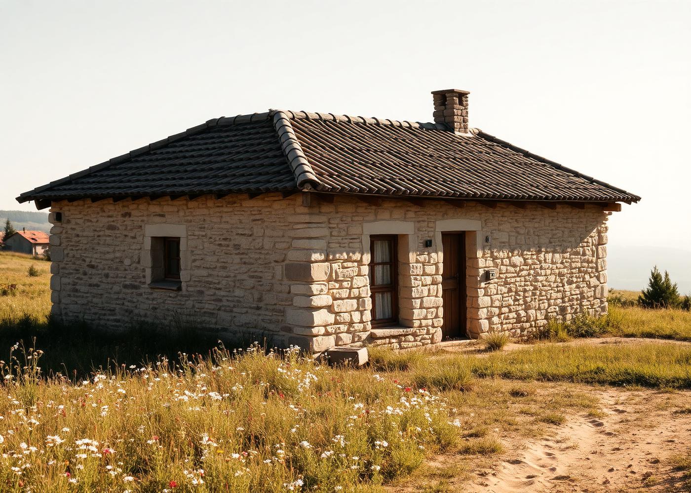
Real stone, real wood, real people. No staged perfection.
Elegant in detail, never showy. Luxury is the calm, not the marble.
We design every touchpoint to remove urgency — from booking confirmations to breakfast timings.
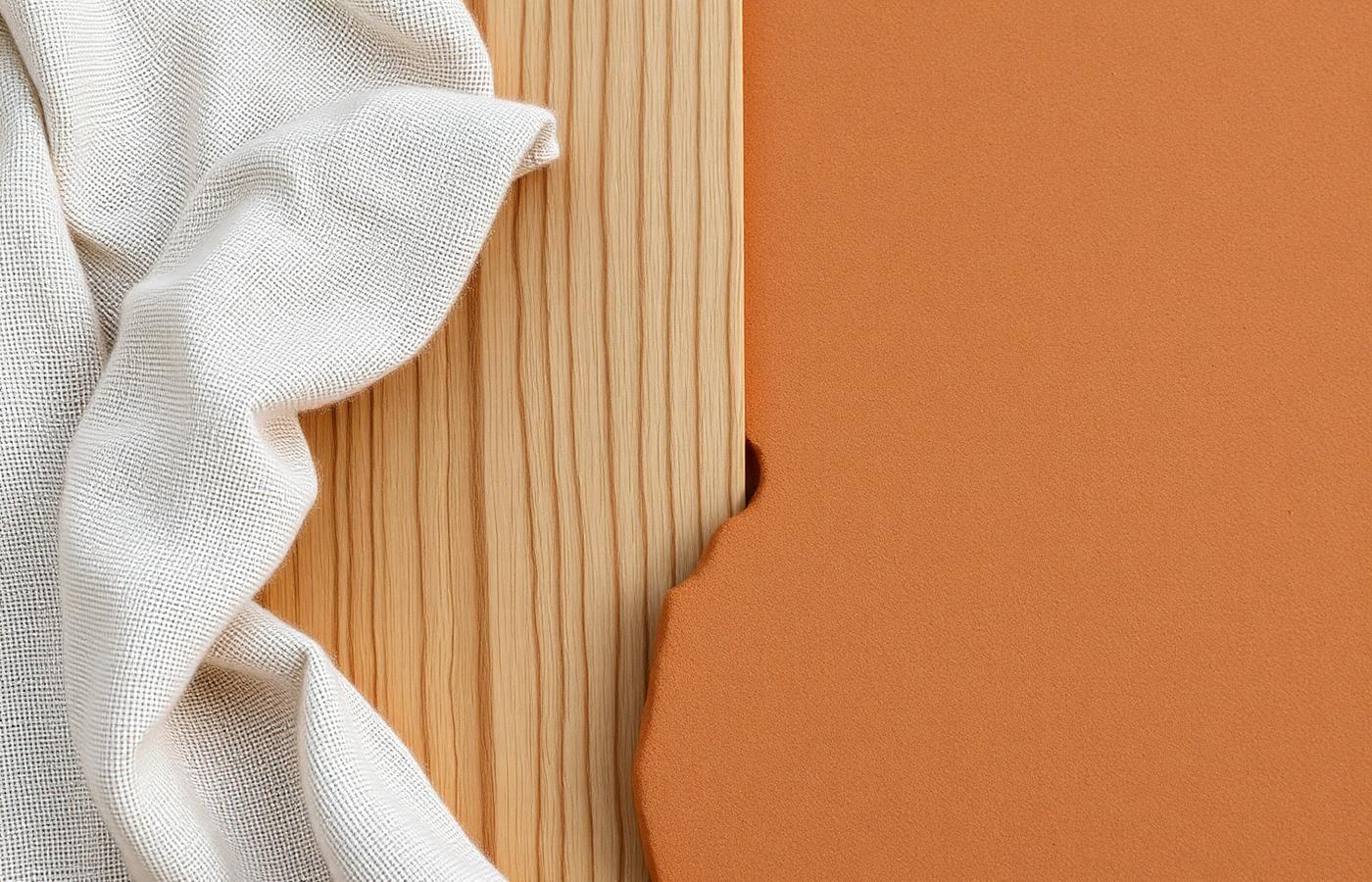
Lime, linen, clay, oak and stone. Materials that age visibly and honestly.
Ceramics, textiles and furniture made within a day's drive of the retreat.
Anticipating needs quietly, never hovering. Hosting as an act of generosity.
Fewer, better things. If it doesn't add calm, it doesn't belong in the room.
We build an identity meant to look right in 2036, not just this season.
We write the way a good host speaks: plainly, warmly and without performance. Short sentences. Concrete nouns. Never salesy.
Invite: “The kitchen is yours after eight.”
Command: “Guests must vacate by eight.”
Be specific: “Figs from the tree by the well.”
Be vague: “Locally sourced seasonal produce.”
Stay calm: “Take the morning slowly.”
Shout: “Book now — don't miss out!”
Sound human: “We'll leave the light on.”
Sound corporate: “Your stay experience awaits.”
02 — Logo System
The final approved Crocna Retreat identity: two official logo variations and three standalone brand marks. Always place the supplied SVG artwork — never rebuild it from type.

Primary Logo
Preferred version for most brand applications

Secondary Logo
Alternative approved colour expression
Primary Logo
The main approved Crocna Retreat lockup. Use it as the default across the website, signage, stationery, print collateral and partnerships. If there is no reason to choose otherwise, this is the version to place.
Secondary Logo
The alternative approved colour expression. Use it when a warmer or more expressive brand application is appropriate — seasonal campaigns, packaging, social artwork and hospitality touches.
Three approved standalone brand marks for applications where the complete logo is not required: social media profile images, favicons, small digital applications, signage details, stationery and decorative brand applications.

Icon 01 — Sage Outline
The quietest of the three. Best on cream and sand surfaces, stationery details and embossing.

Icon 02 — Duotone
Sage ring with a terracotta leaf. The default profile mark for social media and favicons.

Icon 03 — Terracotta
Single-colour terracotta. Strongest at small sizes, signage details and decorative applications.
Minimum Size
120 px / 32 mm
16 px minimum
Never reproduce the primary lockup below 32 mm in print or 120 px on screen. The icon holds down to 16 px.
Safe Area
Keep clear space equal to the height of the letter C on all sides. Nothing enters that margin — no text, no image edge.
Placement
Prefer the horizontal lockup in headers and signage; the vertical lockup for print covers, stamps and packaging.
Six things that quietly undo the identity. When in doubt, use the untouched SVG.
Do not stretch or condense
Do not rotate the lockup
Do not recolour outside the palette
Do not add shadows or outlines
Do not place on busy imagery
CrocnaDo not alter the typeface
03 — Color System
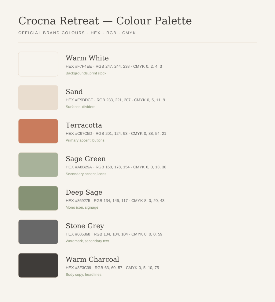
The final palette, sampled directly from the approved logo and icon artwork. Warm White carries the design; Terracotta is the only loud voice in the room.
The default canvas. Page backgrounds, wide margins and airy print stock.
Secondary surfaces: cards, dividers, form fields and quiet section bands.
The primary accent, taken from the logo leaf. Buttons, links and key graphic marks.
The supporting accent from the icon ring: badges, botanical detail and seasonal work.
Monochrome sage version of the icon, small text on light sage and outdoor signage.
The wordmark grey in the official logo. Captions, metadata and thin rules.
All primary body copy and headlines. Never pure black.
Buttons & Accents
Terracotta fills the single primary action per screen. Sage Green is reserved for quieter, secondary invitations.
04 — Typography
Supporting brand typography — Cormorant Garamond for voice, Manrope for clarity, DM Sans where interfaces get small. All three are Google Fonts, licensed for web and print.
Aa
Cormorant Garamond
Headings
Aa
Manrope
Body
Aa
DM Sans
Alternative
Display
Cormorant Garamond Light · 72/76 · -2%
Slow mornings
H1
Cormorant Garamond Light · 56/62 · -1%
A house on the hill
H2
Cormorant Garamond Regular · 40/48 · 0%
The courtyard at noon
H3
Cormorant Garamond Medium · 28/36 · 0%
Bread, figs, cold water
Overline
Manrope SemiBold · 12/16 · +14%
Rooms & Rates
Body
Manrope Regular · 16/28 · 0%
Breakfast is laid out under the walnut tree from eight. Take it whenever you wake — the coffee stays warm, and no one is counting the hours here.
Caption
Manrope Regular · 12/18 · +6% · Stone Grey
The west terrace, photographed in August by Ana Munteanu.
Buttons
Manrope SemiBold · 14 · +4%
Quote
Cormorant Garamond Light Italic · 32/44
“We came for two nights and rewrote the rest of the week around this porch.”
Font Weights
Letter Spacing
Crocna Retreat
Tight -2%
Crocna Retreat
Normal 0%
Crocna Retreat
Wide +8%
Crocna Retreat
Overline +14%
Cormorant Garamond Light headlines over Manrope 400 body. The default for the website, brochures and guest letters.
DM Sans Medium for wayfinding, booking interfaces and anything set below 14px, where Cormorant loses legibility.
Manrope 600 uppercase overlines paired with Stone Grey captions for menus, tags and price lists.
05 — Download Centre
Three packages: the icon set, the logo set and the colour palette. All files are the final approved artwork.
ZIP · 3 SVG assets
Official Crocna Retreat standalone brand marks for digital, print and small-format applications.
Download IconsZIP · 2 SVG assets
Official Crocna Retreat logo variations for approved brand applications.
Download LogoSVG · Brand color reference
Official Crocna Retreat color palette for consistent digital and print applications.
Download Color Palette